# Custom components 2.0
{% hint style="success" %}
Available on *all plans*, both for cloud and on-premise instances in the *Low-code* mode.
{% endhint %}
UI Bakery offers a large number of [built-in components](https://docs.uibakery.io/reference/working-with-components) that you can use in your applications. What is more, you can also create **custom components** if you want to add functionality not available in our component list.\
**Custom components 2.0** feature allows you to utilize AI and its capabilities to quickly and easily create functional components that you can add to your applications. \
The feature has a convenient *Code Editor*, where the code is split into separate files. You can review and tweak everything right inside the Editor if needed.\
Also new custom components are **reusable**, meaning you can use them across multiple projects, not just one (unlike the previous custom components).
In this article, we'll dive into how this feature works and provide some use case examples as well.
## Overview
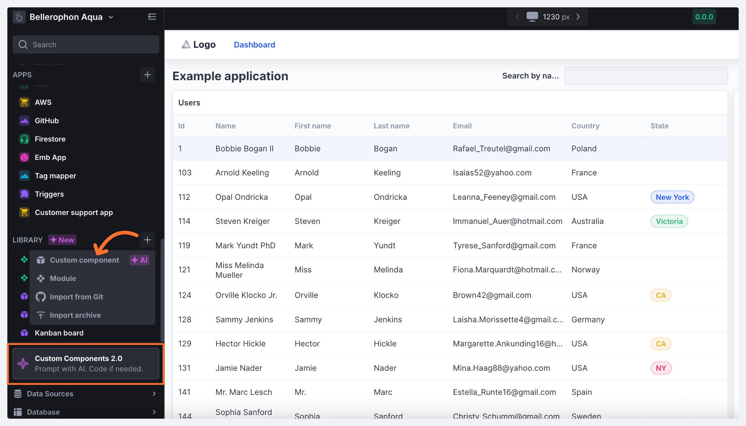
You can access the list of all your custom components, as well as create new ones, in the **Library** section of the workspace menu. Here, click the *+ button* and select *Custom component* or click the *Custom Components 2.0* tile at the bottom of the Library list to launch the AI-powered component builder.
Give your component a name and proceed to the *Builder* mode to start generating the component.
## Building a component
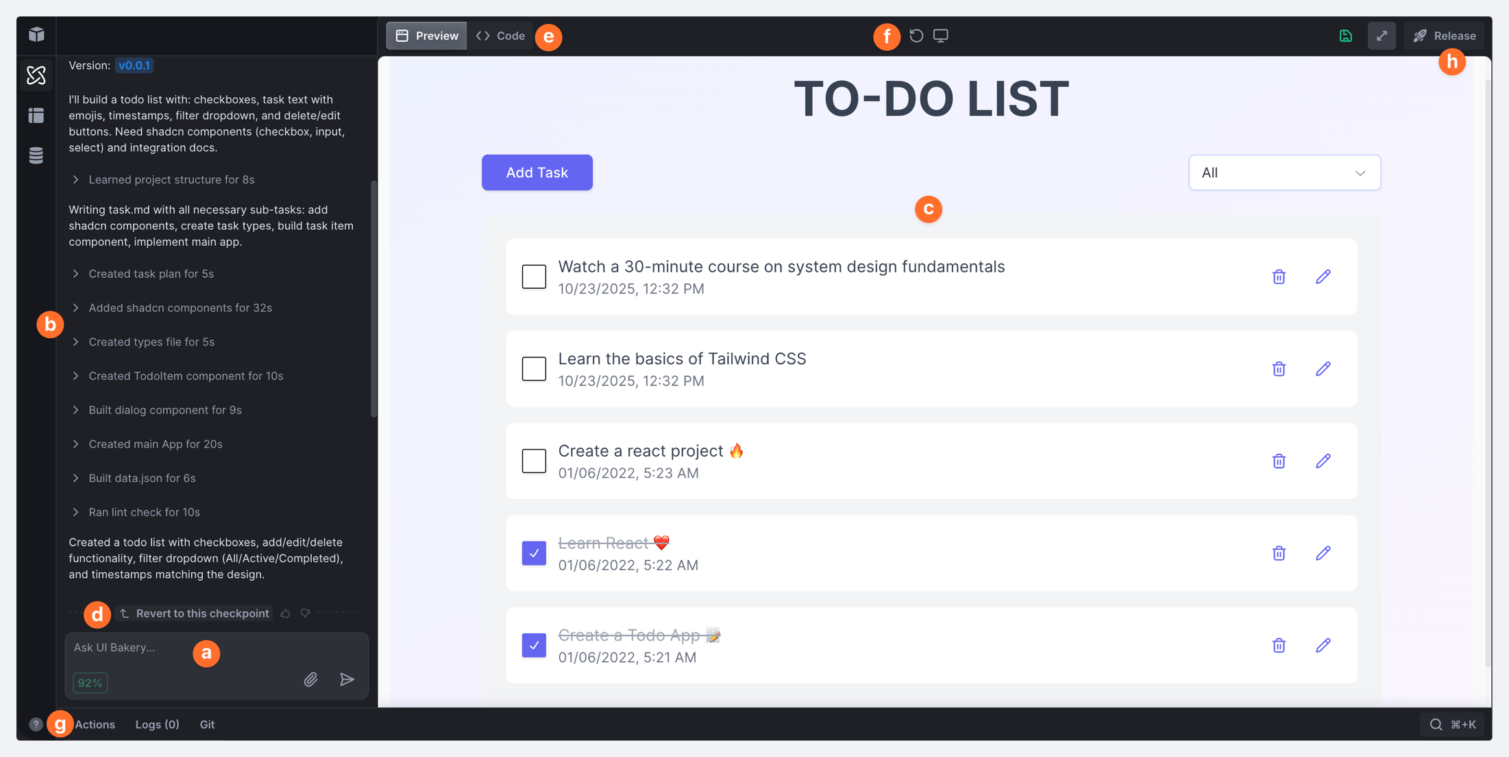
To build a component with AI, you simply need to type in what you want to create or attach an image of a similar UI as a visual aid. The AI Assistant will start working and you'll be able to see all the steps he takes while generating a component based on your prompts.
Let's explore how the custom component works in more details:point\_down:
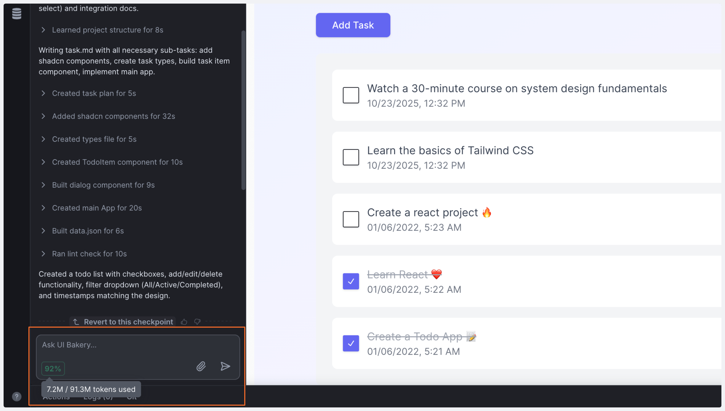
a. This is where you need to type in your prompt or attach an image of what you want to generate.
b. Shows the process and steps the AI Assistant takes based on your prompt.
c. Here you can preview the result component after each iteration the AI takes.
d. Click *Revert to this checkpoint* to revert to the previous version to undo any changes you made or start generating again from a specific iteration.
{% hint style="info" %}
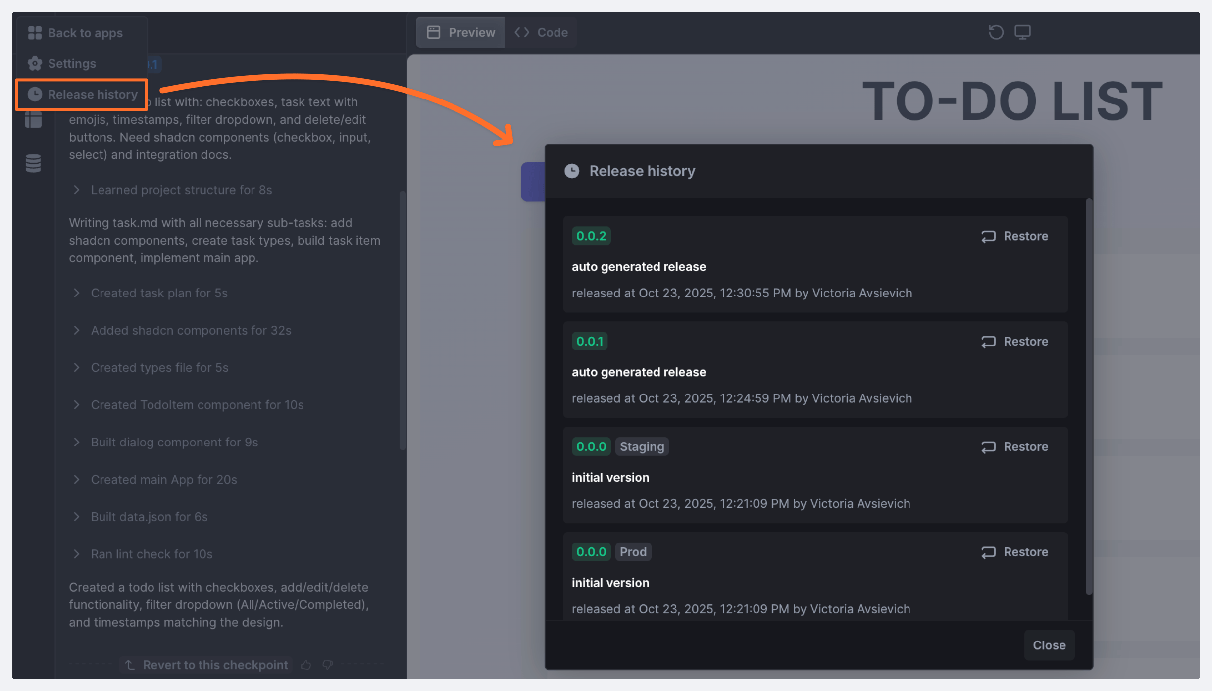
Custom components also have *Release history* (accessible via the button in the upper left corner) where you can view the history of its releases and revert to any version if needed.
{% endhint %}
e. In the *Code* tab, you can inspect the generated code and tweak it to better suit your needs.
f. *Reload* button allows you to refresh the iframe preview of your app or component - without reloading the entire page.
g. You can pass your data to AI in two ways:
* Create and run actions directly from the custom component and ask the AI to use them.
{% hint style="warning" %}
Custom component can only call actions created within the component itself.
{% endhint %}
* Tell the AI which props should come from the host app - you can check or modify the generated `data.json` file. It is located in the *Code* tab and it contains demo settings of the custom component.
{% hint style="info" %}
Only the structure of the data is sent to UI Bakery servers and Open AI.
{% endhint %}
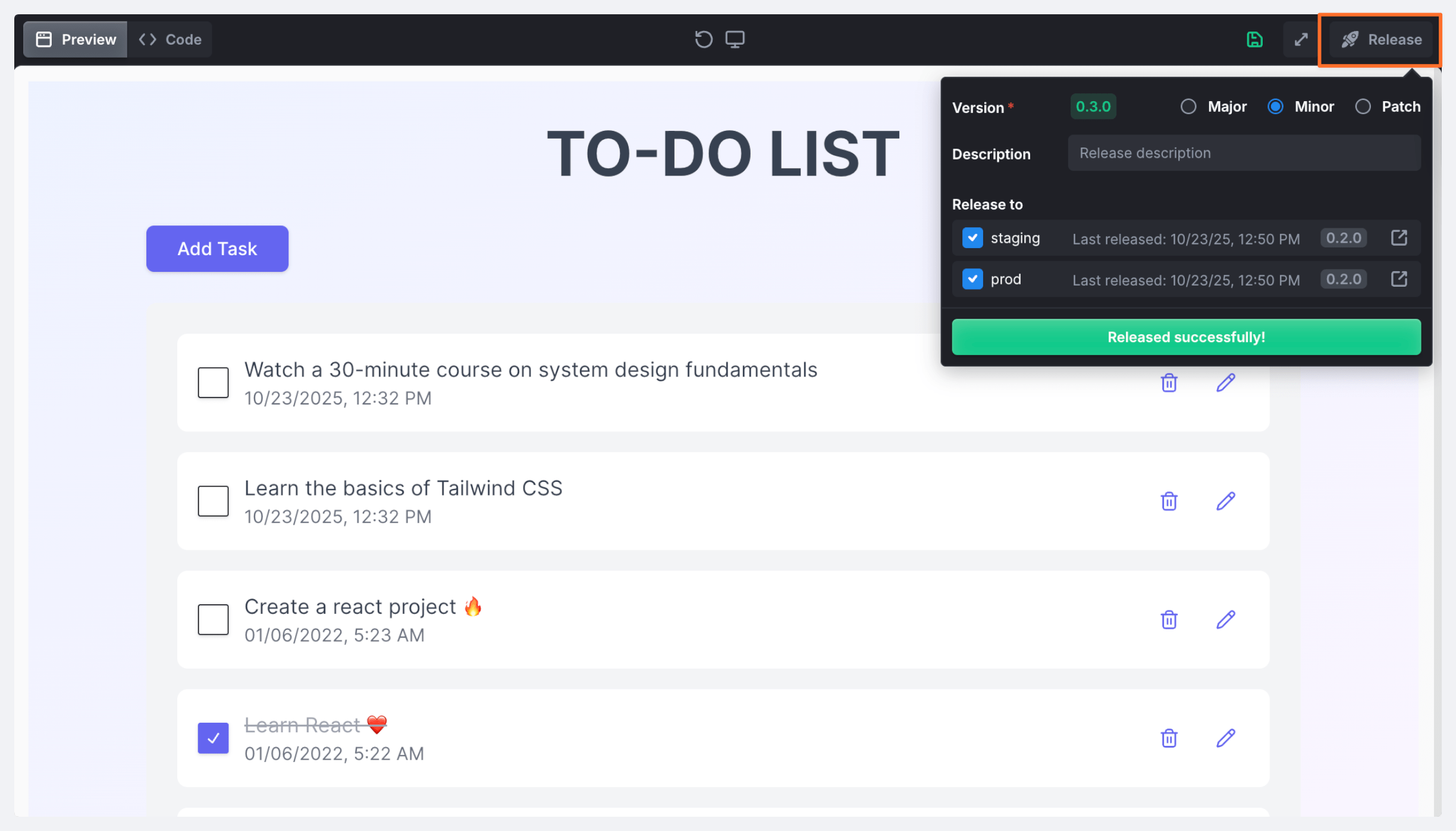
h. Click *Release* to [publish the custom component](#publishing-a-component).
That is the basic flow of creating a custom component - as you see it's quite simple. To watch it in action on specific examples, make sure to check out [this section](#use-case-examples).
### AI usage credits
Every month, *free usage credits* are assigned to users - you can use them to generate custom components. Each time you make a request, credits will be deducted from the balance taking into account the *input*, *output*, and *cached input* ratios.
The actual credits balance is displayed in the bottom left corner of the chatbox in the *Builder* mode.
This way, you'll be able to see how many credits you have left and, if you've already spent all of them and need more, you'll be able to buy them right from the Builder. \
The Not enough credits on your account error will be displayed if you try making requests, and either from there or from the credits balance in the chatbox, you can click *Buy.* You'll be redirected to the billing page where you can buy more usage credits. It's possible to buy *10M* credits in a single transaction.
## Working with a component
Custom components are integrated with UI Bakery using special hooks from the `@uibakery/data` library. They allow the components to interact with the application, specifically *receive data*, *call actions*, and *trigger events*.
{% tabs %}
{% tab title="useData" %}
The `useData` hook allows a component to **receive data** passed to it from UI Bakery by accessing a specific property from the shared data object.
* `useData('prop', defaultValue)` - Returns the value for the property key (`prop` ) from the data object. \
If the data is missing, the default value (`defaultValue`) is returned.
{% endtab %}
{% tab title="Example" %}
```javascript
import { useData } from '@uibakery/data';
// Get the user's name (defaults to 'Guest')
const userName = useData('user.name', 'Guest');
// Get the full user object
const user = useData('user', {});
```
{% endtab %}
{% endtabs %}
{% tabs %}
{% tab title="useLoadAction & useMutateAction" %}
These hooks are designed to work with actions defined in UI Bakery to **load and modify data**.
* `useLoadAction(actionName, defaultValue, params)` - Calls an action to **load** data. Returns an array - `[data, loading, error, refreshData]`.
* `useMutateAction(actionName)` - Calls an action to **modify** (create, update, delete) data. Returns an array - `[mutate, loading, error]`.
{% endtab %}
{% tab title="Example" %}
```javascript
import { useLoadAction, useMutateAction } from '@uibakery/data';
// Loading a list of products
const [products, isLoading, error, refreshProducts] = useLoadAction('loadProducts', []);
// Action to update a product
const [updateProduct] = useMutateAction('updateProduct');
// Calling the update action
updateProduct({ id: 1, name: 'New Name' });
```
{% endtab %}
{% endtabs %}
{% tabs %}
{% tab title="triggerEvent" %}
The `triggerEvent` function allows a component to **send events** to UI Bakery. The user can configure reactions to these events (for example, show a notification, navigate to another page, or execute another action).
{% endtab %}
{% tab title="Example" %}
```javascript
import { triggerEvent } from '@uibakery/data';
// Trigger an event about product creation
triggerEvent({ type: 'productCreated', data: { productId: 123 } });
```
{% endtab %}
{% endtabs %}
### General usage example
```javascript
import { useData, useLoadAction, useMutateAction, triggerEvent } from '@uibakery/data';
function MyComponent() {
// Receiving data from UI Bakery
const componentData = useData('someData', {});
// Loading data via an action
const [items, loading, error, refreshItems] = useLoadAction('loadItems', []);
// Action for creating data
const [createItem] = useMutateAction('createItem');
const handleCreate = () => {
const newItem = { name: 'A New Item' };
// Call the action
createItem(newItem);
// Trigger the event
triggerEvent({ type: 'itemCreated', data: newItem });
};
// ... rest of the component code
}
```
## Publishing a component
Once you're ready to release your component, click the *Release* button in the upper right corner of the screen. Select your version, add a description if you want, and choose the environments you want to deploy to.
{% hint style="success" %}
If you don't publish your custom component, it will be available only in the *Dev* environment. If you want it to be available in *Staging* and *Prod* as well, you need to deploy it to these environments.
{% endhint %}
## Adding a component to an app
You can add any custom component you created to your application. And, as we've mentioned before, you can add custom components to multiple projects.\
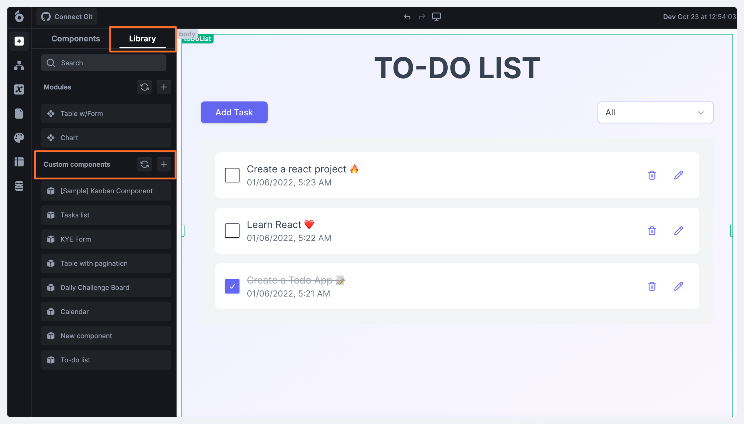
To add a component, click the **Library** tab of the Components section in the app's Builder mode and drag the component you need to the working area.
{% hint style="info" %}
The *Library* tab contains all your created custom components as well as modules.
{% endhint %}
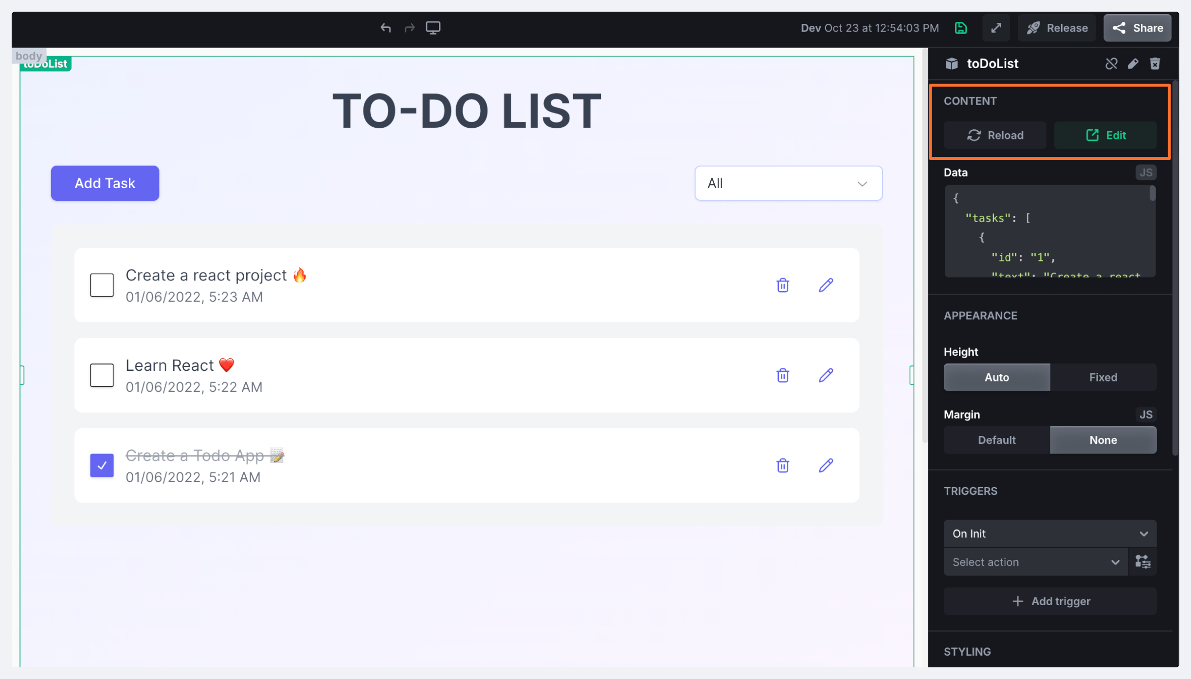
In the right side panel, you'll be able to access and modify the custom component's settings as well as set *On Init* and *On Event* triggers. Here also at the top, you can click the **Edit** button to make any changes you need to the component, and after that you can click **Reload** to refresh these changes in the app.
## Use case examples
Now, let's review some examples of custom components you can generate in UI Bakery. Watch our interactive demos below and learn how you can build similar components yourself.
### To-do list
{% @arcade/embed flowId="kxRzMK0612AM5qG9wv1u" url="" %}
### Know Your Employee (KYE) form
{% @arcade/embed flowId="eGlxuncA16DAba0M6JTh" url="" %}
### Table with server-side pagination
{% @arcade/embed flowId="Zdbh9KcV6TSxK5dJmZih" url="" %}
 {% endhint %}
e. In the *Code* tab, you can inspect the generated code and tweak it to better suit your needs.
f. *Reload* button allows you to refresh the iframe preview of your app or component - without reloading the entire page.
g. You can pass your data to AI in two ways:
* Create and run actions directly from the custom component and ask the AI to use them.
{% hint style="warning" %}
Custom component can only call actions created within the component itself.
{% endhint %}
* Tell the AI which props should come from the host app - you can check or modify the generated `data.json` file. It is located in the *Code* tab and it contains demo settings of the custom component.
{% hint style="info" %}
Only the structure of the data is sent to UI Bakery servers and Open AI.
{% endhint %}
h. Click *Release* to [publish the custom component](#publishing-a-component).
That is the basic flow of creating a custom component - as you see it's quite simple. To watch it in action on specific examples, make sure to check out [this section](#use-case-examples).
### AI usage credits
Every month, *free usage credits* are assigned to users - you can use them to generate custom components. Each time you make a request, credits will be deducted from the balance taking into account the *input*, *output*, and *cached input* ratios.
The actual credits balance is displayed in the bottom left corner of the chatbox in the *Builder* mode.
{% endhint %}
e. In the *Code* tab, you can inspect the generated code and tweak it to better suit your needs.
f. *Reload* button allows you to refresh the iframe preview of your app or component - without reloading the entire page.
g. You can pass your data to AI in two ways:
* Create and run actions directly from the custom component and ask the AI to use them.
{% hint style="warning" %}
Custom component can only call actions created within the component itself.
{% endhint %}
* Tell the AI which props should come from the host app - you can check or modify the generated `data.json` file. It is located in the *Code* tab and it contains demo settings of the custom component.
{% hint style="info" %}
Only the structure of the data is sent to UI Bakery servers and Open AI.
{% endhint %}
h. Click *Release* to [publish the custom component](#publishing-a-component).
That is the basic flow of creating a custom component - as you see it's quite simple. To watch it in action on specific examples, make sure to check out [this section](#use-case-examples).
### AI usage credits
Every month, *free usage credits* are assigned to users - you can use them to generate custom components. Each time you make a request, credits will be deducted from the balance taking into account the *input*, *output*, and *cached input* ratios.
The actual credits balance is displayed in the bottom left corner of the chatbox in the *Builder* mode.