
| Name | Type | Description |
|---|---|---|
name | string | Component name |
value | any | Current component value |
valid | boolean | Indicates if the component is valid |
validating | boolean | Indicates if the component is validating |
| Name | Parameters | Returns | Description |
|---|---|---|---|
setValue | value: any | void | Set component value |
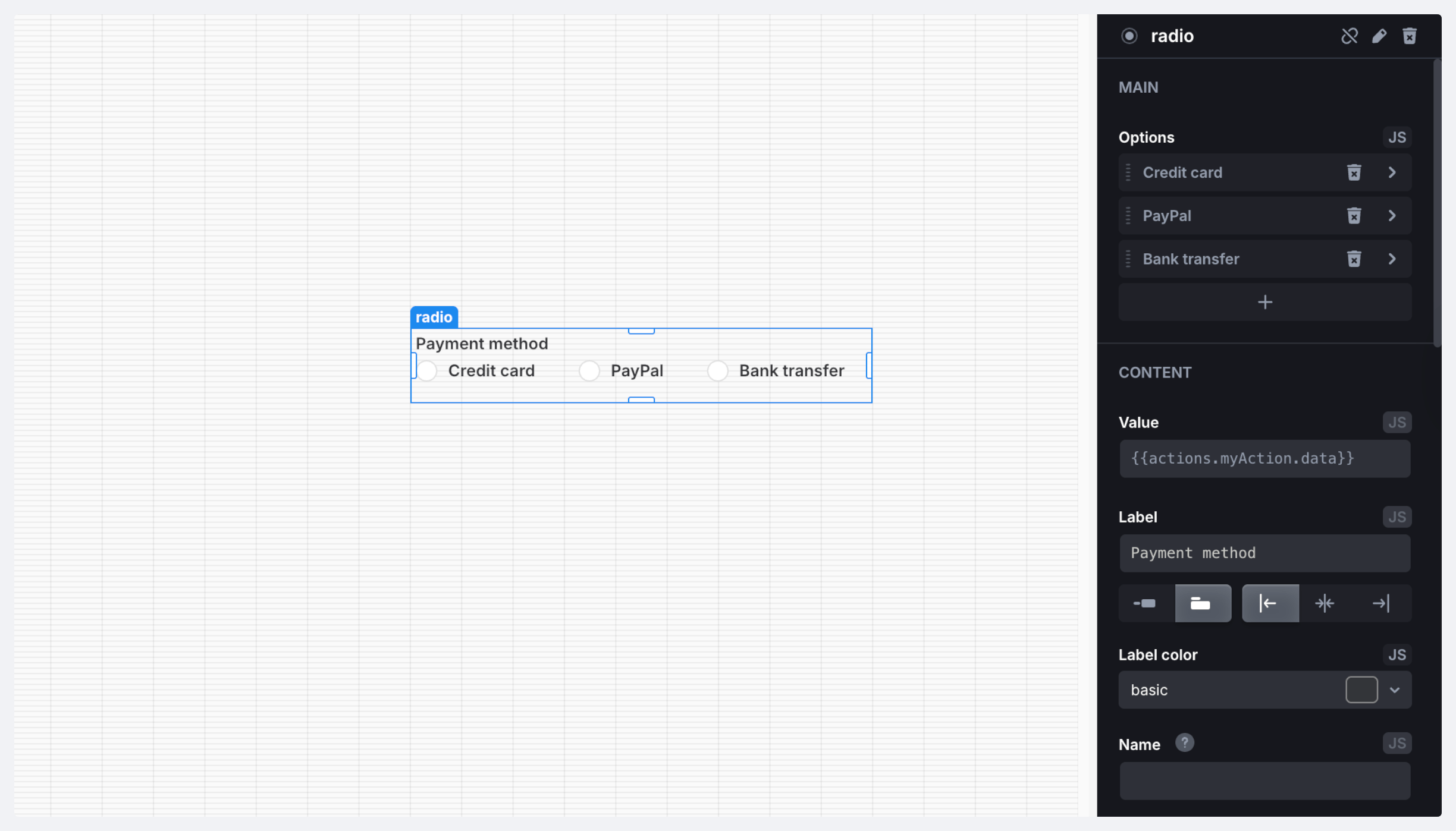
setOptions | options: object[] | void | Set options for the radio component. Options is an array of objects with the following structure:
|
setDisabled | disabled: boolean | void | Disable or enable the component |
reset | – | void | Reset component to the initial value |
resetValidation | – | void | Clear validation errors |
setErrors |
| void | Mark the component as invalid and displays errors |
| Name | Description |
|---|---|
| On Change | Triggered when the component's state changes |
| On Focus | Triggered when the component is in focus |
| On Blur | Triggered when the component loses focus |
| On Init | Triggered when the component is initialized |