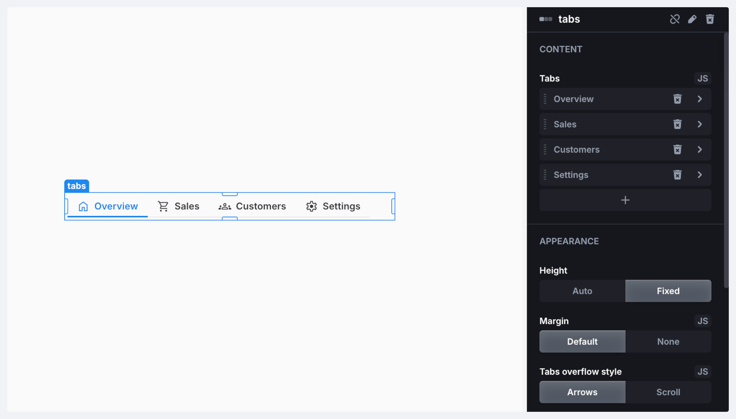
| Name | Type | Description |
|---|---|---|
name | string | Component name |
length | number | Total number of tabs |
selectedTab | tab | The selected tab (alternative property to index) |
selectedIndex | number | Index of the currently selected tab |
| Name | Parameters | Returns | Description |
|---|---|---|---|
selectTab | index: number | void | Select tab by its index |
| Name | Description | |
|---|---|---|
| On Init | Triggered when the component is initialized | |
| On Tab Change | Triggered when a tab is switched |
